Below are a bunch of great charts on the macroeconomics of health care. They’re from various sources, as indicated. With each chart, I will make a few comments. But I’m not going to attempt to weave them into a broader narrative because, frankly, I haven’t figured out anything to say that isn’t clear from the charts or included in other recent posts. So, enjoy the charts! Follow the links for details.
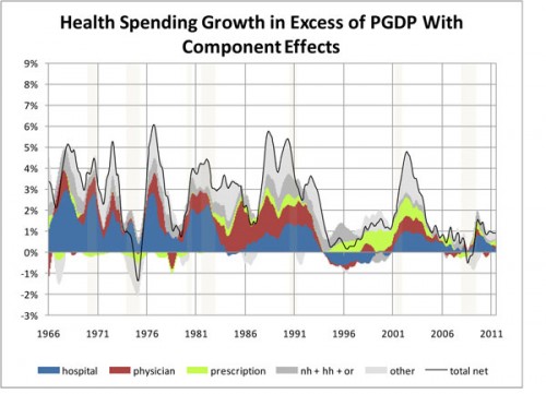
From Charles Roehrig, here’s health care spending growth and its components, in excess of potential GDP (GDP at full employment). A post in which I discussed a related chart is here. Clearly health spending growth began to fall prior to the recent economic downturn.
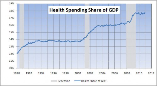
Also from Charles Roehrig, the following chart shows that most of the increase in the health spending-GDP ratio since 1990 has occurred during and around recessions. Even if health spending or spending growth goes down during recessions (see chart below this one), it does not go down enough to offset the decrease in GDP.
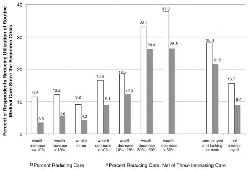
By Annamaria Lusardi, Daniel Schneider, and Peter Tufano, the following chart shows for 2009 the relationship between changes in wealth/employment and use of medical care. Clearly less health spending is associated with loss of wealth or employment. However, even among those whose wealth did not go down, more respondents reported lower health spending.
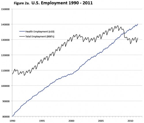
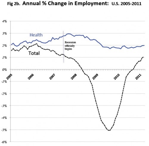
The following four charts are all from Tom Getzen. First, look how relatively immune health care employment is to recessions. Even if we are spending less (relative to trend) on health care in recessions, employment doesn’t seem to deviate much from trend.
Next is the same thing in terms of percent changes. There was, in fact, a dip in growth in health employment during the recent economic downturn, but nothing like that experienced economy-wide. Health employment continued to grow even as other employment fell.
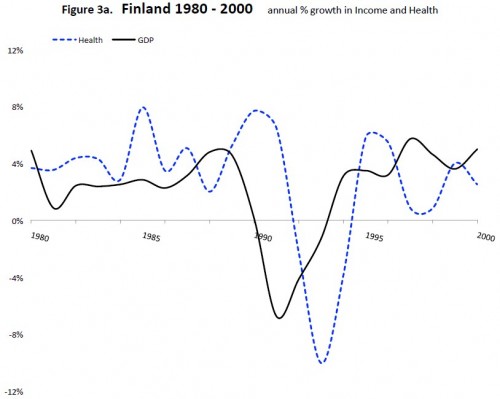
The following is an interesting chart based on Finland data that shows that changes in health spending lag those of GDP by a couple of years. Lags of this type occur in the US and other nations too, but I don’t have a pretty chart to share for any country but Finland. (Such a thing would not be hard to produce, but more than I care to do as of this writing.)
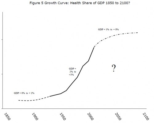
Here is the big question in chart form: when will growth in US health spending as a proportion of GDP level off? One thing that is clear from above, this is as much a question about GDP growth as it is about health care spending growth. Since growth in health sector employment probably signals increasing health spending (beyond what it would otherwise be), it can’t be the solution even if it does help increase GDP. Yet, as health care increases as a proportion of GDP, it becomes harder to boost GDP without boosting health spending.

