This post uses charts to explain some concepts underlying economic interpretation of health care geographic variation studies. I learned most of the content from Amitabh Chandra and Jon Skinner. (This paper by Amitabh offers one, insightful review of the basics.) I thank Garret Johnson for drafts of some of the charts below. Any errors are mine.
Productive and Allocative Efficiency
The only way to begin is with productive and allocative efficiency. For convenience, let’s imagine the health system as composed of geographic regions. (This is not always ideal. At the end, I will consider organizations within regions.) A region is productively efficient if its resources (inputs, spending) are used to produce the most health possible. Allocative efficiency is obtained within the health system if no rearrangement of the same, aggregate resources across regions can increase health.
Different policies are appropriate depending on whether the health system is allocatively inefficient or whether some regions are productively inefficient. What do geographic variations tell us about policy? It depends.
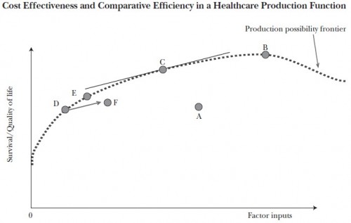
Consider the chart below, from a paper by by Chandra and colleagues. (I’ve discussed this chart before, here and here.) It shows regional health care inputs (e.g., spending) and outputs (survival/quality of life) for regions A-F. A production function — which relates inputs to outputs — for some of the regions is plotted. You can think of the production function as a codification of all the expertise, processes, and technology of a system. The one shown is also labeled “production possibility frontier,” which designates the most health (survival/quality of life) a region can produce for any level of resources (factor inputs).
Regions associated with points A and F are not productively efficient since they’re below the frontier. The policy goal is to improve productivity of A and F to get them up to the frontier (or at least closer). It’s not clear that either adding or subtracting inputs to/from A or F would help in this regard. They need to be made more efficient with whatever level of inputs they are provided.
Regions associated with points other than A or F share the same production function and happen all to be productively efficient (because they’re on the frontier). For those, policy intervention that reallocates inputs is clearly helpful. For the same total inputs, we can increase allocative efficiency by, for example, moving point D up the curve (rightward) and B down the curve (leftward). Because of diminishing marginal returns, for every additional unit of input allocated to D, greater additional survival/quality is achieved than is lost by subtracting a unit from B.
We cannot fully assess and address allocative inefficiency until we’ve addressed variation in productive inefficiency. Job one is to get regions A and F up to the same production function as the other regions.
Spending Variation
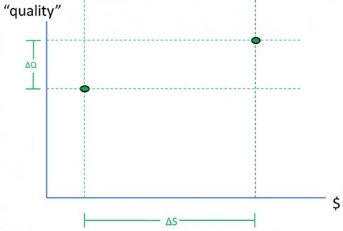
Now let’s explore what geographic variations can tell us about productive or allocative inefficiency. Suppose all we know is mean and variation (ΔS, as illustrated in the really dumb chart just below) in spending across regions. Does that reveal whether there’s productive vs. allocative inefficiency? (No, but keep reading to see why.)
Let’s add axes (see the chart just below). “Quality” on the vertical axis is anything from process quality measures to hard outcomes (mortality, QALYs). Spending ($) is the horizontal axis. The vertical, dashed lines indicate what we can infer from spending variation ΔS (and mean): regional spending is in the range of values between the vertical lines (or most of it, if we’re talking some number of standard deviations, for instance). For simplicity, let’s imagine there are only two regions, one with spending somewhere on the left dashed line, the other on the right.
What does this imply about production functions? (Keep reading.)
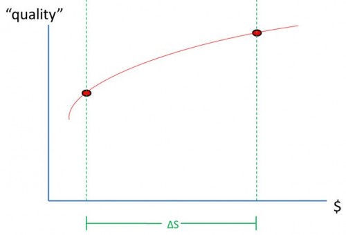
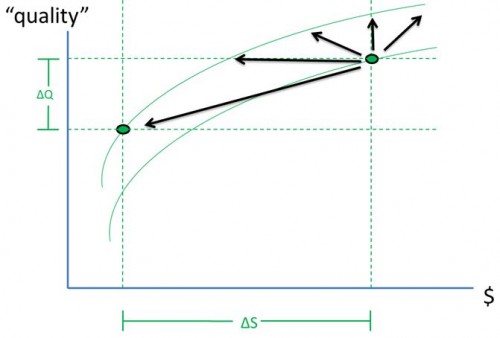
One possibility is that the two regions could be on the same production function, as shown below. In that case, there’s allocative inefficiency because we can improve quality, on average, by moving the left point rightward and the right point leftward by the same amount along the common production function until the two points meet. (Technicality: All production functions are concave down, i.e. with non-positive second derivatives.) There may also be productive inefficiency if the common production function is not the production possibility frontier.
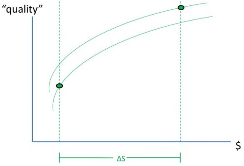
Another possibility is that the two regions could be on different production functions, as shown below. In that case, there’s definitely productive inefficiency: one region’s production function is below another. From spending variation alone, we can neither distinguish the chart immediate below from the one immediately above nor infer whether either region is operating at the production possibility frontier. We cannot conclude whether there is productive or allocative inefficiency. Hence, it’s not clear what the appropriate policy intervention should be.
Quality Variation
Now let’s add quality variation (ΔQ) information, as in the chart just below. This lets us locate the regions’ operating points. They’re at the intersection of the dashed, horizontal and vertical lines. Notice that, in general, we still cannot tell whether these points lie on one production function or two. (These are the same locations of points used in the prior two charts.) So, we still don’t know very much about policy.
However, if we imagine we know just a bit more, we can make some progress. Let’s suppose we’ve measured quality in two ways: we’ve measured rates at which the two regions provide what I’ll call “costly never” and “cheap always” services. Here’s what I mean by those:
- “Costly never” = high cost stuff that shouldn’t happen (or should be rare). Example: hospitalization for issues that could have been addressed with ambulatory care (aka, prevention quality indicators or ambulatory care sensitive conditions).
- “Cheap always” = low cost stuff that should always happen (to the right people). Example: annual blood glucose testing for diabetics.
If we find evidence that each of the two health systems provide some “costly never” services while not always providing “cheap always” services and at different rates, that suggests two different production functions.* And, in that case, a reasonable policy goal would be to push the lower production function up towards the higher one, as indicated below. Importantly, it is not evident that it would be a good policy idea to withdraw resources from one of these regions and reallocate them to the other one because even if we know there are two production functions, we don’t know their shapes (which I’ve drawn arbitrarily): we don’t know which is operating in a region of higher marginal quality returns to resources.
Notice that as the lower production function is pushed up (and changes shape, perhaps), variation in some types of quality and spending could each grow or shrink. Degree of variation alone isn’t necessarily informative. But, as noted above, variation in certain kinds of services (e.g., “costly never” and “cheap always”) may be.
Comparing Two Systems
The point that variation alone is not informative about efficiency is the principal takeaway from the recently published study led by Michael McWilliams (for which I was a coauthor). Let’s go through that point in charts.
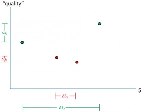
Imagine two health care systems: system 1 and system 2. (System 1 could be the Medicare and system 2 the VA, as in our study, for example.) The amount of spending variation across regions served in each system, ΔS1 and ΔS2, is illustrated in the chart below. What does this geographic variation in spending tell us about the efficiency of each system? Which system is more efficient, system 1 or system 2? (Not much by itself and can’t tell, but read on.)
Consider also variation in quality produced by each system. We’ll call that ΔQ1 and ΔQ2, which are illustrated by the lines shown along the vertical axis in the chart above. Now which system is more efficient? (In general, we still cannot tell, actually.)
It’s tempting to say that a system with greater variation in spending and/or quality (in this case system 2) is less efficient. Is that right? (Nope.)
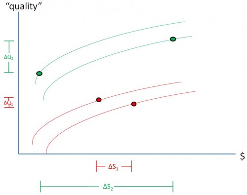
Let’s draw in some possible production functions, as in the chart below. Looks like it’s possible for system 2 to be more efficient than system 1, even though variation is larger in the former than the latter. And, even though that’s the case, both systems harbor some inefficiency. We were able to draw these conclusions in our paper based on the kind of quality we measured and relying on prior work. But, in general, variation all by itself isn’t informative about type of and relative efficiency.
Positive and Negative Associations
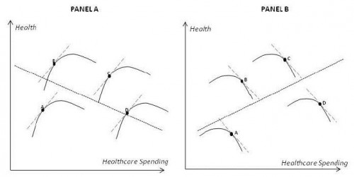
Are you puzzled by some findings that show a negative association between spending and health while others show a positive association? Do you wonder which results are telling us the truth about the efficiency of our health system? Turns out, those types of results, by themselves, may not be very revealing. This is illustrated in the following chart from a paper by Amitabh Chandra.
Panel A shows regions that are all operating on the positive marginal return parts of their production functions. Yet the spending-health relationship across them is negative. Panel B shows regions all operating on the negative marginal return parts of their production functions. Yet the aggregate spending-health relationship is positive. (See also Simpson’s Paradox. This, by the way, is a type of ecological fallacy.)
The deeper point about this and all of the forgoing discussion is that without a thorough analysis of production functions, we don’t know very much. Some types of geographic variation studies can be a bit revealing, depending on what they analyze, but geographic variation in general (by itself) is not informative about efficiency.
Within vs. Across Regions
One final note: I’ve couched all the above in terms of regions, but studies have shown that variation across providers (e.g., hospitals) within regions is larger than variation across regions. Each region can harbor both more and less efficient providers. This implies that region based policy is too crude. Now go back to the top of the post and read it all again replacing “regions” with “hospitals.” 🙂
* If the analysis is done right, meaning controlling for risk-adjusted costs across the two service types. A lot of stuff in this post only makes sense controlling for risk and if “spending” is interpreted as “real resource use.” Fuzzing out some technical details like this has pedagogical value.

