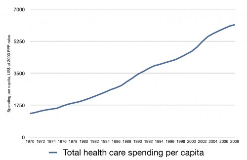
After I posted the chart yesterday with health care spending as a percentage of GDP over the last few decades, a number of people asked how much changes seen were due to GDP and not health care costs. So let’s take GDP out of it. Here is US health care spending per capita over the same time period (OECD data):
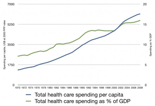
And here’s one more just for Austin. It’s both spending per capita and spending as a percentage of GDP on the same chart. There are two axes here:
Seems to me like spending grows and grows, regardless of changes to GDP.


