Democrats seem to believe that most Americans want to preserve the 20th-century welfare state programs. But they are unwilling to ask voters to pay for them, and they are unwilling to describe the tax increases that would be required to cover their exploding future costs.
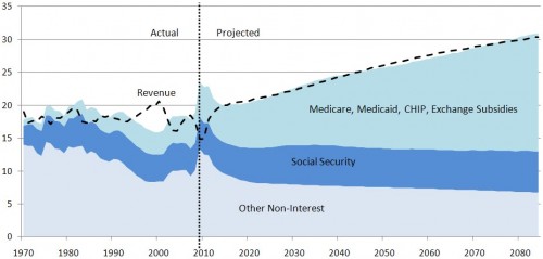
The CBO’s baseline projection* of the federal primary budget as a percent of GDP after passage of health reform:
Maybe Democrats have not successfully communicated that the intention and scored prediction of the law is to fully balance the budget as far as the eye can see and to do so with tax increases. I’ll grant that. Maybe we don’t believe future Congresses will allow tax revenue to grow as large as depicted in order to cover the government’s costs. I’ll grant that too.
But I do recall quite a vociferous debate over just this issue. Did Americans fail to notice that the health reform law spends a lot of money and includes a lot of tax increases? If so, that’s not just a Democratic messaging problem, but a Republican one too, and a general media failure. What more would it take to communicate this?
That being said, it certainly appears as if the intention of last year’s Democratically controlled Congress was to balance the books, at least insofar as the primary budget is concerned. (The primary budget excludes interest on the debt, which is large. If you don’t like the graph in that link, here’s another.)
We can do better in communication and in policy. But we cannot ignore the expected revenue in the ACA. Where does that revenue come from? Taxes and fees. I’m not saying anyone has to like that or support it. I’m saying it’s what’s in the law. And CBO agrees.
* For their other projection — the alternative fiscal scenario — see these many posts.
UPDATE: Added link to graph with debt interest.
UPDATE 2: Added another link to a different post with a debt interest graph. Also added footnote about the alternative fiscal scenario.
by Jim on April 12th, 2011 at 00:20
How much does including interest on debt change this graph?
by Austin Frakt on April 12th, 2011 at 08:55
A lot. http://theincidentaleconomist.com/wordpress/budget-projection-with-debt-interest/
by Rick on April 12th, 2011 at 23:19
Not so fast Austin Frakt! The graph that includes debt interest is FUNDAMENTALLY DIFFERENT than the graph above. The graph above shows revenues and non-interest spending are about equal in the future with both growing roughly equally over time. This implies future balanced budgets and no new debt year after year. The other graph includes interest expense, but it also shows spending growing even more than the graph above AND it shows revenues at a flat 20% of GDP rather than revenue growth. In other words it shows annual NEW debt of 5-10% of GDP. These HUGE annual deficits create huge NEW debt year after year which leads to the ever-growing burden of interest year after year. The spending and revenue assumptions of the two are entirely different.
by Austin Frakt on April 13th, 2011 at 07:37
I sometimes make the mistake that readers have read my full body of posts. That’s a silly assumption. So, I added a link to a graph with debt interest: http://theincidentaleconomist.com/wordpress/budget-projection-with-debt-interest/ . I did note this in the post. Trust me, if I had a complete time series from CBO on debt interest I’d put it in this chart. I really, really want that and I’ve been asking for it for months. Doesn’t exist, as far as I know. And I think that is a shame.
by Russell on April 13th, 2011 at 08:47
I’m with Rick on this. The linked graph showing the budget with interest bears absolutely no resemblance to the graph in this post. Night and day.
Given that this post is derived from real CBO data, and the linked graph is, well, apparently something Congressional Republicans pulled out of their collective asses to score political points, I know which I have more faith in.
by Austin Frakt on April 13th, 2011 at 08:50
Another one: http://theincidentaleconomist.com/wordpress/this-one-is-interesting-pun-intended/ .
CBO should be doing this.