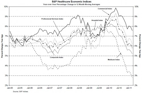
From S&P:
These are year-over-year changes in revenue accrued by sector/provider type. But what does it mean that Medicare went down more than others (or increased less fast, to be precise)?
My hypotheses are (1) that seniors are more cost conscious and (2) policy change. All sectors saw a drop due to the recession, a result of cost sharing and increase in rates of uninsurance. Seniors likely cut back too, perhaps dropping supplemental coverage and forgoing the marginal prescription fill, doctor visit, or procedure. And it isn’t too much of a stretch to believe seniors have cut back more since their incomes are driven, in part, by the market (invested 401(k) and IRA holdings). Cuts to Medicare relative to trend played a role too, but I’m not sure how much that explains. I don’t have a handle (off the top of my head) as to how much was cut over the last 1.5 years.
What’s interesting is that Medicare appears to be a leading indicator, at least on the downward slope. I don’t know what happened to cause the big dip in 2006-2009. It coincides with the roll out of the Medicare prescription drug program. Did that actually cause a big reduction in growth of Medicare spending (with small spillovers to other sectors)? Along with Part D, Medicare Advantage grew a lot over that period. Is that the cause? (If so, wow!)
I’m sure I’m missing some other important considerations. What?


