UPDATE: Kudos to reader Addi Faeber below. While I assumed that out-of-pocket burden did not include premiums, he noticed that they do here. While everything I said may be true, the chart doesn’t necessarily show this. What it does show is that if someone else (like your employer) isn’t picking up the costs, you have to. That’s not as interesting as I thought. I’ll leave the post up here to be accountable, but please don’t use all of my prior interpretations.
Austin and I were chatting about a goldmine of charts at EPI’s The State of Working America (h/t Jared Bernstein – whose blog you should be reading). There’s tons of good stuff there, like this:
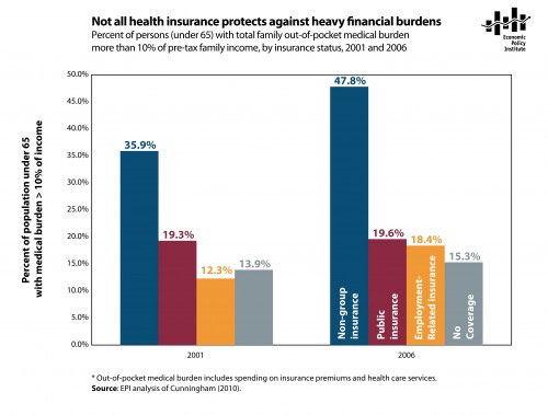
You’re looking at the percent of people under 65 who have family medical expenses more than 10% of income. It’s shown in two years, 2001 and 2006, and by different types of insurance.
There are a number of striking things to consider. First, note the consistency of public insurance (red). Employer related insurance (yellow), on the other hand, eroded a bit over those years.
But what you really want to note is the blue column. That’s non-group insurance, or insurance that people have to go buy on their own. Almost half of those people have medical expenses more than 10% of income, even with insurance.
Those are the people who will benefit the most from the exchanges of the PPACA. Arguably, those in the blue column are the people who will see the greatest benefit from the law. It may not be perfect, but many of those people in the blue line are going to find it a lot easier to get better insurance in 2014. I look forward to seeing how the graph will change then.
Economic Policy Institute. 2011. Not all health insurance protects against heavy financial burdens. The State of Working America. Washington, D.C.: Economic Policy Institute. Feb. 14, 2011. <www.stateofworkingamerica.org/jobs/figure104>.

