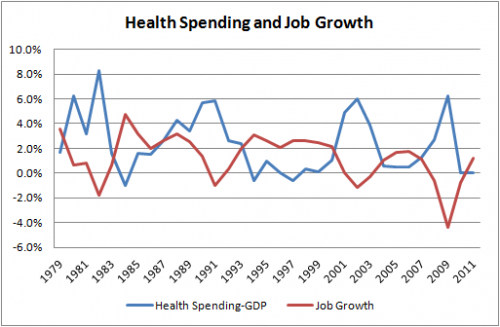
Jared Bernstein shared the chart below, sourcing it to “National Health Expenditures data, BEA, BLS.” You can click over to read his take on it. Mine is much simpler. Perhaps before you read either, you might take a moment to see what story your brain spins from this chart. (This might make a good exam question in a Masters or PhD health economics program.)
Surprise! There’s no story to tell. It’s just math. What we’re seeing is a demonstration that X and Y-X are negatively correlated. A decrease in job growth (red line) is associated with a decrease in GDP growth (recessions in the early 1980s, 1990s, 2000s, and the BIG ONE circa 2008). Health spending growth is relatively less sensitive to business cycles. That makes the difference between health spending growth and GDP growth bigger (blue line). So, a negative correlation is nearly guaranteed.


