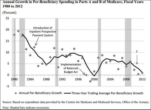
From recent analysis by Michael Levine and Melinda Buntin of the CBO:
Spending growth has fluctuated over the past several decades, but previous declines were typically associated with significant policy changes (see Figure [in which I’ve added the question mark]). For instance, the drop that began in the early 1980s was caused partly by the anticipation and implementation of the inpatient prospective payment system. The sharp drop in the late 1990s was precipitated in part by the Balanced Budget Act of 1997, which enacted a broad range of changes in payments to providers. But the most recent slowdown in spending, which began in the mid-2000s, cannot be so readily explained by legislated changes in policy. […]
Annual nominal growth in FFS spending per elderly beneficiary, which on average was very similar to the growth in per-person spending for all Medicare beneficiaries, was 7.1 percent from 2000 to 2005 and 3.8 percent from 2007 to 2010.2 The difference in growth rates between those two periods, 3.2 percentage points (rounded), constitutes the slowdown our study seeks to explain. […]
To try to identify the causes of that slowdown, we performed a series of descriptive and statistical analyses based on a diverse array of data sources. However, those analyses did not yield an explanation for most of the slowdown in spending growth.
Fully 75% of the 3.2 percentage point difference between 2000-2005 and 2007-2012 per beneficiary spending growth cannot be explained by payment rate changes, beneficiary demand due to age and health status, Part A only enrollment, prescription drug use, the financial crisis and economic downturn, supplemental coverage.
Needless to say, this is a big and important mystery.


