From a recent paper by Gerhardt et al. (PDF):
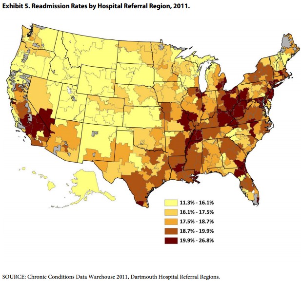
There is clear geographic clustering, with relatively lower rates in most of the western half of the country, with the exception of in and near California, and relatively higher rates in the eastern half, with the exception of the upper mid-west. I wonder to what extent this variation can be explained by disease burden vs. system factors (acknowledging the endogeneity of diagnoses).
by Matthew on May 30th, 2013 at 13:22
I think graphs like this are mostly meaningless as a health outcome measure. Low population density areas seem to have uniformly lower readmission rates, even though we know that rural areas are often less healthy interms of lifespans and disease prevalence, So it seems to me the most likely answer is that people tend not to be readmitted when hospitals are far away from home. On the otherhand, the highest readmissions rates seem to be in areas with the best hospitals, which suggests to me that really challenging are simply migrating to the best hospitals.
by Austin Frakt on May 30th, 2013 at 14:09
Awesome comment.
by patricksamson on May 31st, 2013 at 05:52
yes, the chart can be meaningless in this case.But still it can throw light on different factors such as composition of society, living standard etc.
by Austin Frakt on May 31st, 2013 at 06:12
You should decide whether you think it is meaningless or light throwing. Can’t be both, right?
by SAO on May 31st, 2013 at 00:28
Interesting point. If the hospital is close enough that you can go home and sleep in your own bed and get back to the hospital if you have any problems, you go home — and have a significantly higher chance of being readmitted.
But, you’re probably saving Medicaid/care money, as opposed to sleeping in your hospital bed.
by Greg Dursteler on May 31st, 2013 at 11:51
Interesting chart. I’d like to see an overlay with obesity rates. Seems to mirror those to some extent, but maybe that’s just my imagination playing tricks on me.
by Matthew on June 1st, 2013 at 12:49
You can find the graph of obesity rates at the bottom of my post here: http://hyperplanes.blogspot.com/2013/04/sarah-kliff-on-female-mortality-rates.html (I got the graph from Cornell health economist and obesity expert Jon Cawley. Don’t remember if he made it, or if he got it from somewhere else, though I have seen the same graph in CDC reports).
It looks to me like there is a slight correlation between the two, though I’d caution against arguing that obesity causes the high readmission rate. The regions for which the correlation is strongest (appalachia and the south along the mississippi) are also quite poor and receive an unusually high level of welfare benefits, including benefits that are not available to the rest of the country (the federal government gives special benefits to regions like appalachia that are both “economically depressed” and “geographically isolated”). Moreover, we know that obesity and poverty are correlated for women and children, two groups eligible for the most welfare, especially medicaid an CHIP. There’s also an elevated concentration of VA hospitals in those regions, as they have higher numbers of veterans, and those veterans are much more likely to qualify for VA benefits.
The point is that those regions differ quite substantially in the type of medical insurance due to demographics, and that seems likely to me to affect readmission rates, since hospitals really don’t want to keep low-paying medicaid patients any longer than they absolutely have to.