
Here’s another chart from the JAMA study “The Anatomy of Health Care in the United States” (click to enlarge):
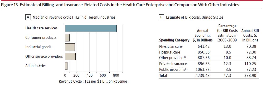
It looks bad for health care. But what’s this “revenue cycle FTE per $1 billion revenue” business (the horizontal axis)? The footnote (not shown) references an Institute of Medicine report, in which I found similar chart along with the explanation:
One approach to compare the relative resources required for the revenue cycle across industries is to look at the number of staff, measured in fulltime equivalents (FTEs) required per dollar cost. Many non-healthcare sectors operate close to or below 100 FTEs per $1 billion collected compared with median staff levels of 810 FTEs per $1 billion collected for physician practices.
This is new to me, but I guess the idea is, how many people (or FTEs) does it take to suck in $1B in revenue? The fewer it takes, the more efficient the sector. With all the billing, coding, claims processing, and the like going on in health care, I buy that it’d be among the least efficient industries in this regard. If I don’t seem to have this quite right, school me in the comments.
Still, that health care is 16 times less efficient than the “all industries” average, by this measure, has got to be meaningful, if not shocking.
