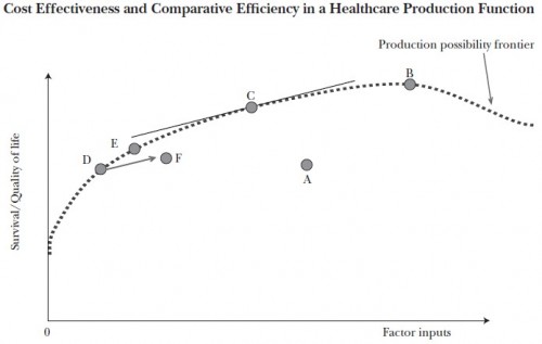
The curve in the chart below is the health care production possibility frontier. To keep this post brief, I will assume you know what it represents. If not, see this prior post and/or, perhaps better, that one.
If the health system were on the “flat of the curve” we’d be at point B on the production possibility frontier. Some argue things are even worse, that we’re to the right of B on the curve. Actually, we’re not in any of those places. But if we were, the solution would be relatively simple: stop investing so many resources (factor inputs) in health care. Stop spending so much. Problem solved.
Except, in fact, we know we cannot be at point B or to the right of point B. We know this because we have evidence that we’re not even on the production possibility frontier curve. We’re at some point below the frontier, like A or F. The evidence that this is so is that we have under-use of valuable care simultaneous with over-use of unnecessary care. That can’t happen on the production possibility frontier, by definition.
The good news is that we’re not on the flat of the curve. The bad news is that solving the problems in health care requires something much harder than just spending less. We have to spend differently. To be on the flat of the curve we’d have to first be on the curve. And we’re not. That’s the problem.


