
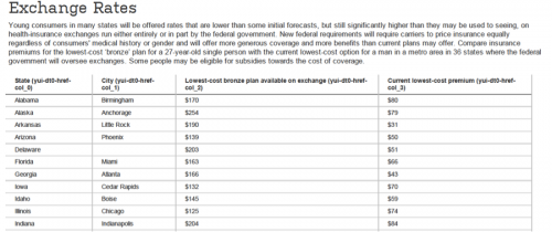
The NYT and WSJ both feature charts today on state-by-state comparisons of premiums for health insurance policies in the exchanges. The WSJ chart is a health policy fail because it compares apples to zombies (bronze exchange policies with today’s cheapest available bare-bones coverage) and fails to include the tax subsidies. Both deficiencies are noted, but that just means they knew the chart was misleading:
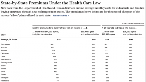
The NYT chart shows the premiums (with and without subsidies) for a family of four and a 27 year old, using the second-cheapest Silver plan. Much better, but it would still be interesting to also see the current cost of an actuarially-equivalent plan. An excerpt:
@koutterson
