This is another post related to a talk I’m preparing. I’m getting weary of linking back to all my relevant prior posts. If you want them, you’ll find those links embedded in the second paragraph of this post. And, I will be posting my slides once they’re made, probably in a couple of weeks.
I finally found the source of some of the graphs I’d like to use for my talk at Princeton’s Woodrow Wilson School. Turns out, they’re from a presentation that, then CBO Director, Peter Orszag gave at the same venerable institution in 2008. Here they are, with appropriate attribution.
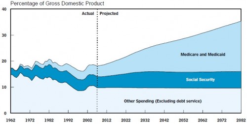
You’ve seen this before. Something should frighten you about this graph, and it isn’t Social Security or the painfully small font (click to enlarge).
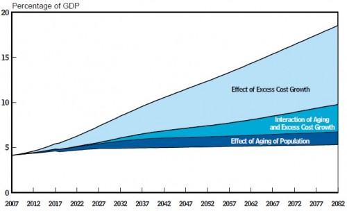
And, lest you think all the Medicare spending increases are due to aging of the population, …
Orszag has a few bullets in the talk to the effect that the media tend to focus on demographics when discussing Medicare cost problems. It’s the retirement of the baby boom generation, they say. It’s that the size of the workforce relative to retirees is shrinking, we’re told. Um, no, it really isn’t (much). It’s health care cost inflation above general economic growth (excess cost growth).


