The 2006 Health Affairs paper Is Technological Change In Medicine Always Worth It? The Case Of Acute Myocardial Infarction, by Jonathan Skinner, Douglas Staiger, and Elliott Fisher, is a rewarding read. (That link is to an ungated pdf, so you can easily claim your reward.) There’s enough in it for several posts, and in this one I will focus on one set of points that are nicely captured by Exhibit 5 of the paper.
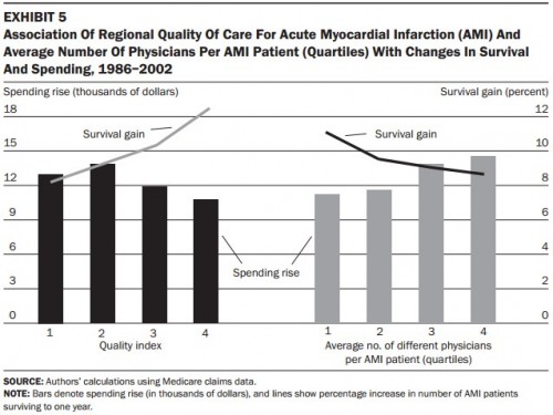
Exhibit 5 is below. It’s frighteningly busy. I will go through it slowly, so don’t click away in disgust yet. You can get this. I promise!
First note that this is a figure showing region-level relationships between survival gains for Medicare patients with acute myocardial infarction (AMI)* and aspects of the health systems in which they received care. “Regional” in the title means hospital referral region (HRR), of which there are 306 in the US. The lines (gray on left, black on right) are percent survival gains between 1986 and 2002 (right hand scale). The bars (black on left, gray on right) are Medicare spending increases for AMI patients, in thousands of dollars over 1986 to 2002 (left hand scale).
There are really two charts embedded in this single figure, as you’ve probably guessed by now. Let’s focus first on the left side, marked “Quality index” on the horizontal axis. The quality index is a composite of quality indicators pertaining to care for AMI patients built from the percentage in the region who were given aspirin and beta-blockers at discharge and reperfusion (either thrombolitics — clot-busting drugs — or coronary angioplasty) within 12 hours of admission for an AMI. All of these are known to reduce AMI mortality and, thus, are indicators of higher quality AMI care. Thus, one would expect that a higher quality score (like 4, the maximum) would be associated with higher gains in survival and that a lower quality score (like 1, the minimum) would be associated with lower survival gains.
In fact, that’s what the chart shows. The survival gain line on the left is upward sloping, higher for a high quality index score and lower for a low score. Perhaps surprisingly, spending is not higher for higher quality regions that are also associated with higher survival gains, as indicated by the black bars. In fact, regions with the highest quality and most survival gains also have the lowest spending increases. This suggests that spending is not the key — or not the only factor — in quality and survival. High quality systems seem to be highly efficient, with higher survival gains and lower spending increases.
If quality is a hallmark of an efficient system, what’s a hallmark of an inefficient one? Turns out the number of different physicians caring for an AMI patient is associated with lower efficiency. That’s what’s shown on the right hand side of the chart. The quartiles of the number of physicians caring for an AMI patient is indicated on the horizontal axis: group 4 has the most physicians per patient and group 1 the least. Looking at the bars (spending increases) and the line (survival gains), we see that more physicians is not better. More docs on the case both costs more and is associated with lower survival gains. A system with a lot of physicians per patient is inefficient, perhaps due to coordination failures stemming from the fractured nature of care.
(The authors note the combinatorial explosion in number of interactions required for every physician to communicate with every other. For example, with eight doctors caring for a patient, 28 interactions (whether verbal or written) would be required for each to know what the other has done.)
Putting all this together, the take-away is that the increases in productive efficiency (health gains per spending increase) of regions varies according to how regions deliver care. (This is almost tautological.) Regions that do the basic, low-tech things well (like consistently giving aspirin and beta-blockers to AMI patients at discharge) and offer better coordinated care (e.g., by having fewer physicians treating an AMI episode) are more productively efficient.
The aggregation of all the ways a system takes in money and produces health is its “health production function.” What I’ve just said above in many words and with a chart is that different regions have different production functions. To give a little more away from the paper by Skinner, Staiger, and Fisher, this fact explains why some cross-sectional studies show a negative spending-outcomes correlation and some longitudinal ones suggest a positive relationship. If you’ve made it this far, you might as well read the paper yourself to see the explanation. It’s worth your time.
* Heart attack.


