Austin tipped me off about some slide sets made by the National Institute for Health Care Management. Today, I want to focus on some from “The Concentration of Personal Health Care Spending“. Let’s start with this:
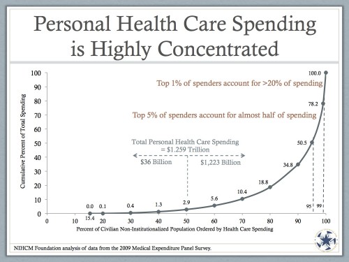
You’ve seen a slide like this before, I bet. But basically, what it’s showing is that a small number of people account for a ton of personal health care spending. In fact, the bottom 50% of spenders account for only $36 billion in personal health spending. That’s less than 3% of all of it.
Why is this important? Well, because the entire idea of health savings accounts and increased cost sharing is to encourage people to spend less on personal health spending. The idea is that people who don’t really need the care will choose to spend less. What we often ignore, however, are the high spenders. Those people, on the right side, would blow through their health savings account pretty quickly. At that point, they have no more deductibles and no more co-pays, and there are no more incentives to spend less. So the whole idea won’t work on then. It might, however, work on people who don’t spend as much.
But as the chart shows, there’s not that much to save there. Look at this one:
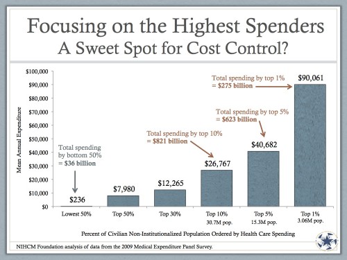
The people in the lowest 50% of spenders spend about $236 per year. Let’s say we can “incentivize” them to spend half that (which, by the way, is WAY more than most think would be saved with increased cost sharing). We’ll save – what – $120 per person, or $18 billion? Chump change.
What we need to focus on are the people on the right. The top 5% of spenders, who account for about half of all personal health spending, blow through more than $40,600 per person. That’s WAY more than they’d put in a health savings account. There’s no hope of them keeping any money in it. So they won’t care, and they won’t try. The effect some are hoping for won’t be felt in those who need to feel it most.
So I’m skeptical. But it gets worse. Part 2 later.


