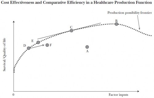
The following chart, from a spring 2011 paper by Amitabh Chandra, Anupam Jena, and Jonathan Skinner and related commentary are worth understanding. The horizontal axis represents the cost of health factor inputs. The vertical axis is the quality and quantity of life; think of it as quality adjusted life years (QALY). The dotted line is the “production possibility frontier,” meaning that all points on and below the line can be attained by the health system and points above it cannot. For a given cost (factor inputs) higher up the survival/quality of life axis is to be preferred. Likewise, for a given survival/quality of life value, lower cost is to be preferred.
The U.S. healthcare system, represented by point A in [the figure], falls far short of the production possibility frontier, whether because of wasteful costs […], or because of shortfalls in health outcomes which would include both reductions in health and lives lost owing to sins of omission (lack of effective care such as prophylactic antibiotics prior to surgery) or sins of commission […]. The application of comparative effectiveness research to every possible treatment option would move the country to point B, at the peak of the production function. This point would almost certainly be more costly than our current status quo, but would represent a point where all possible health-related gains have been exhausted.
While point B is productively efficient, it is allocatively inefficient, given that the foregone consumption of attaining that last QALY is so high at point B […]. By contrast, the objective of cost effectiveness is to adopt only those treatments that yield QALYs at a reasonable cost—where “reasonable” is of course open to interpretation. If we adopt for convenience a guideline of $100,000 per QALY or unadjusted life-year […], then an exhaustive set of studies would again lead us into productive efficiency but at a different point on the production possibility frontier (specifically, at point C ). At this point, the slope of the frontier is equal to the inverse of this cost-effectiveness “hurdle” rate, in this case 1/$100,000.* Economists would prefer point C to B since the forgone (nonhealth) consumption involved in getting from C to B exceeds the value of improved health. Intuitively, with the cost-effectiveness approach, all potential treatments are considered, but only those options that improve health for less than $100,000 per QALY, or that scale back on treatments costing more than $100,000 per QALY (such as that anticancer drug that cost an average of $93,000 for an average gain in life of four months) are chosen. In the aggregate, health outcomes would improve and costs would likely decline, but some subsets of the population, such as incurable prostate cancer patients, could end up being worse off. […]
[Consider beginning] on the production possibility frontier at point D. Now consider two approaches to expanding a new, potentially cost-effective treatment. In the case where only those appropriate for care get it, outcomes and costs improve, to point E, still on the “best practice” production possibility frontier. But in the case where treatment is extended across all patients, corresponding to point F, outcomes are worse, and costs are higher because the procedure is now done for a wider swath of patients. With variations in healthcare systems with regard to appropriate use of new technologies, extending treatment could even lead to a negative correlation between spending and outcomes, as illustrated by points E and F.
* If this hurts your brain, think of it this way. If we array the cost of each unit increase in QALY from lowest to highest, at some point the cost exceeds a threshold, $100,000 as an example. At that point, we’ve reached the (self-imposed) point of diminishing returns. The slope of the production function becomes too shallow at that point, schematically illustrated as point C in the chart. That’s where we should stop spending for allocative efficiency.
AF


