Kevin’s post sparked my interest, so I took a look at the MA DHCFP Report. I haven’t read all the text, but a few charts jumped out at me and are worth sharing.
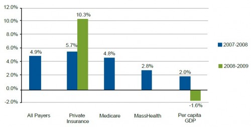
The chart just below is the first chart in the report. It illustrates that in 2007-2008, the rate of increase in spending by Massachusetts private insurers outpaced that of public insurers, Medicare and MassHealth, the state’s Medicaid program. The chart also shows the very large increase in private insurance spending in 2008-2009, but does not include comparable figures for public programs. (The chart is based on work by Mathematica Policy Research.)
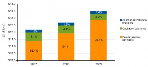
Why is spending going up so quickly? For that, return to Kevin’s post. One thing to add, though. Most of the spending is via a fee-for-service payment model, as shown in the following figure (also from MPR-based work). FFS offers the potential to control (or negotiate) prices, but not utilization patterns and overall volume. It’s a bit like saying you won’t pay me $1 million all at once (a high price) but you’re willing to pay me $1 million in singles if I send you the bills (low price but still, overall high spending).


