Whenever I speak about the quality of the US health care system, I talk about a handful of indicators that organizations use to compare different systems. Inevitably, someone chooses one of them, and then starts to scream that because THAT one indicator is flawed, everything I said is a lie. The biggest one people like to pick apart is infant mortality.
My response is always the same:
To be honest, there is some truth in what you are saying. Bottom line, [insert measure here] is flawed. All measures are. That’s why you will never hear anyone who is serious about this issue use [selected measure] as the only measure to promote single payer. It is one of many. As I usually say, “it doesn’t matter which metric you pick, life expectancy, infant mortality, maternal mortality, levels of vaccination, continuity of care, access, cost, or most importantly, preventable years of life lost – the US is middling at best and often worst when compared to comparable nations.”
That said, you would hope that we wouldn’t place LAST in [selected measure] when compared to other countries, and with all the spending we do on our health care system, it certainly isn’t getting us the quality you expect.
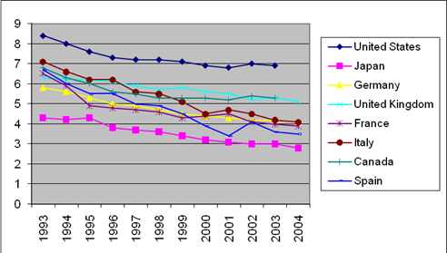
Indulge me for a second, though. Here is a graph I made from OECD data showing infant mortality over a decade:

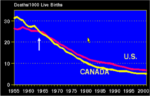
It’s not that we’re the worst that concerns me (well, a little) – it’s that after spending something like 2-3 times as much as these other countries, we aren’t clearly the best! One more slide since you’re letting me be wonky:
This is Infant Mortality in the US (pink) and Canada (yellow). As you can see, Canada used to have a higher infant mortality than the US. See the white arrow pointing to when they flipped? Know what happened during that time? That’s when Canada was shifting into a single payer system. No joke.


