Last month I posted a chart from a recent Milliman report that showed the evolution over time of “skin in the game” for a typical family of four enrolled in a PPO. Similar charts pertaining to Medicare have been provided by the Kaiser Family Foundation. I reproduce a few below.
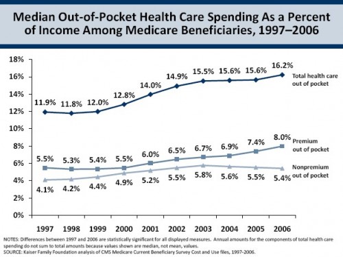
The first chart illustrates median out-of-pocket costs as a percent of income (total, premium only, and non-premium cost-sharing only) for Medicare beneficiaries over the period 1997-2006.
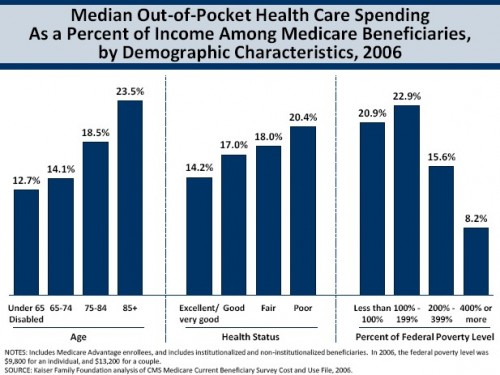
Though it has generally gone up over time, this doesn’t look like a whole lot of skin. But, remember, it’s for a median beneficiary. By definition over half of beneficiaries pay more. The next chart reveals a little bit about who pays more. Older, sicker, and lower-income beneficiaries generally pay more of their care, relative to income. Before you say, “Duh!” to the last one, remember that there is additional help for low-income Medicare beneficiaries. So, they pay more despite the low-income subsidy program in Part D, Medicaid, and other low income benefits.
To the extent that health and age are correlated with income, it isn’t surprising that older and sicker beneficiaries pay more. Also, sicker (and older) beneficiaries have more expenses. So, again, not surprising.
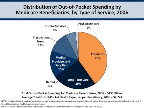
However, a lot of the out-of-pocket spending has nothing to do with the services used and more to do with premiums. The next chart shows this. Forty percent of Medicare beneficiaries’ spending is in premiums. A substantial portion is in long-term care (19%). Medical providers and supplies (at 15%) and prescription drugs (at 12%) also consume large fractions of out-of-pocket health spending. Hospital services and post-acute care out-of-pocket spending are rather modest (6% and 2%, respectively). This suggests that Medicare Part A is relatively more generous than Part B, at least compared to the services people seem to want.


