I’ve been reading a prepublication copy of a book titled Explaining Divergent Levels of Longevity in High-Income Countries, published by the National Academies. It’s chock full of interesting data, so it’s likely that I’ll be posting on it a number of times in the near future. Many of you don’t like comparative health data between countries, but I maintain it’s invaluable. I concede that individual data points and cherry-picked data can be manipulated, but thoughtful analyses can tell us a great deal about our health care system.
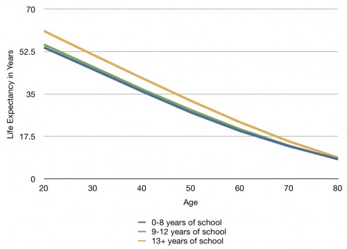
Let’s start with some US-only data, though. A chapter at the end deals with the effect of inequality on life expectancy. Here, for instance, is a chart I made from data on the relationship between years of education and life expectancy at various ages by the end of the 1990’s:
What I find interesting is the stark contrast between those who graduate from high school and those who do not. There is a difference between those in the lesser two educated categories, but this is dwarfed by the difference between those who make it into higher education and those who don’t.
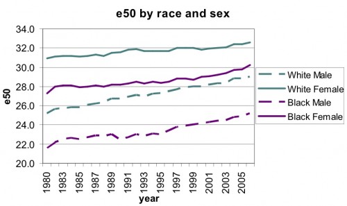
Another chart deals with differences in life expectancy at the age of 50 by race over time:
 What’s interesting about this one is how consistent the racial differences are over more than 25 years. There’s very little closing of any gap between races in either gender.
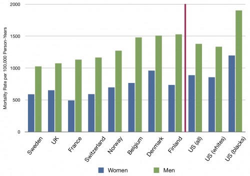
This final chart depicts the mortality rates for people 30-74 in a number of countries standardized to the US Census population in 1995, for both men and women. To the right of the red line are the US (overall), then US whites, then US blacks:
It’s not just that the US does surprisingly badly overall; it’s how much worse blacks in the US fare compared not only to whites in the US, but also to every other country.


