If you haven’t read the introduction, go back and read it now. That introductory post also includes links to all the posts in this series on how we can rate the quality of the US health care system. Each of these pieces will discuss another way to look at quality, and how the US compares to comparable countries in that domain.
Here’s where we are supposed to shine. Many people believe that the true strength of our health care system lies in our ability to treat life-threatening illness. In effect, they believe that our health care system succeeds by preventing death from major diseases. Those are measurable data.
For each of these, I will present OECD data on the G8 countries, without the Russian Federation, which does not submit comparative data. I present the G8 countries because of all countries, these are the ones whose relative wealth and standing in the world should make them most likely to compete with us. And, for each of these measurements, I will present all available data from 1990 onwards, lest you accuse me of cherry picking a year. To make it easy to read these graphs, when I am making charts from OECD data, I will always make the United States a nice red line.
I’m going to be presenting you with a lot of charts today, because I want to cast a pretty wide net. All of these will be considering mortality rates, or how many people die each year from certain diseases. Before you start to talk about survival rates, go read this. It explains why I’m not going to use that misleading statistic.
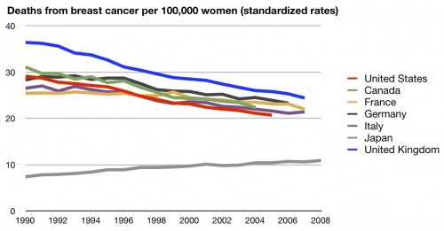
Let’s start with cancer. And, because I want to be fair, I’m going to go in alphabetical order for the different types of cancer. Here’s breast cancer mortality:
Well, the good news is that we are among the best in the world when it comes to breast cancer mortality. We’re not the best, but we’ve been #2 in the G8 for a while. Japan however, seems to be doing much, much better than we are.
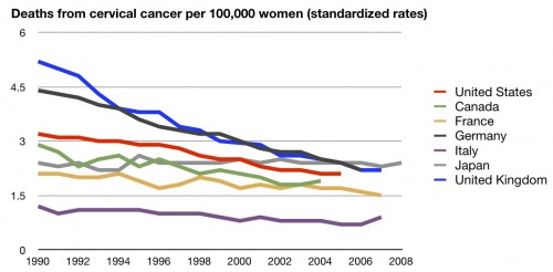
Next up is cervical cancer mortality:
Granted, cervical cancer is nowhere near as prevalent as breast cancer, so far fewer women die of it every year. But compared to comparable countries, I think it’s safe to say that we are middle of the pack in treating it.
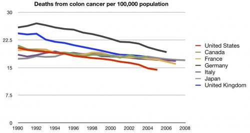
How about colon cancer?
We are very good in treating colon cancer, with the lowest mortality rates when compared to comparable countries. A solid win for he US.
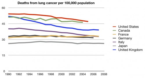
The deadliest cancer, in terms of killing the largest number of people, is lung cancer. How do we stack up there?
Shockingly bad. We’re dead last. And before you start blaming high smoking rates, remember that the US has some of the lowest rates of tobacco use of these countries.
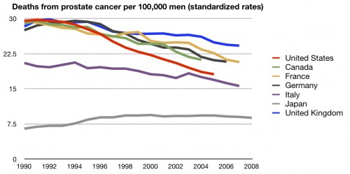
Let’s round things out with prostate cancer:
Could be worse. We’re certainly not the worst, but nor are we the best.
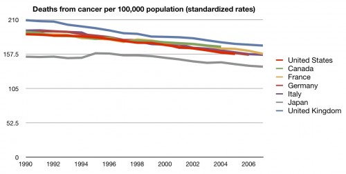
So, some good news and some bad news. How does this all combine in terms of our treatment of cancer overall?
Not nearly where you’d like to see us. Because we don’t do as well with some of the more prevalent cancers, we wind up doing much worse overall when it comes to cancer mortality than you’d think. This is why, when some point to us having the “best” health care system, they focus on colon cancer or breast cancer, not on lung cancer. Overall, though, we’re not.
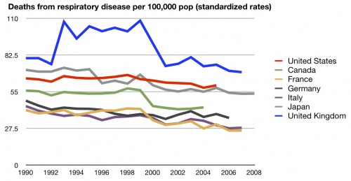
But that’s cancer. How do we do in treating respiratory diseases?
Not so good. We beat the UK, but no one else. Less common than cancer, but still, a fair number of people die from these illnesses.
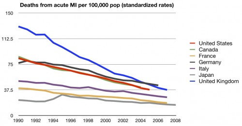
How about deaths from heart attacks?
Solid middle of the road again.
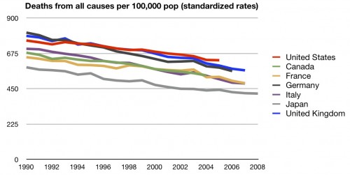
I don’t want you to think I’m cherry picking diseases, though. Here’s how we stack up in mortality from all causes.
Last place. Not where you’d expect to find the “best” health care system.
Now I know a few of you are going to look at the list of “causes” I link to and take exception with some of them. I agree that deaths from assaults, suicides, falls, etc. can’t be blamed entirely on the health care system. But the number of deaths from the causes you are likely to complain about are small in relation to the total number of deaths. Moreover, were not the worst in death rates in all those “questionable” categories. So that’s not the answer.
Plus, this is where we are supposed to shine. Preventing death is traditionally where we should feel safe in our skill. Unfortunately, we do well in some subsets, while middling or terrible in others. Overall, we’re in the bottom half when it comes to this category.
That’s nothing to brag about.
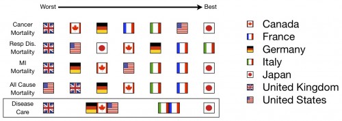
Here’s the third scorecard:
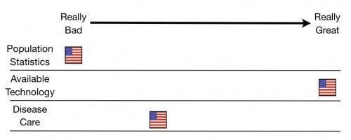
And here’s the running total for the series:
A further explanation of these charts can be found here.
UPDATE: I made a mistake on the charts and fixed them. It’s my goal to be accurate, not to make the US look good or bad.

