This post is cited in the 18 March 2010 edition of the Health Wonk Review.
My post earlier today explained the difference between administrative and competitive pricing systems. The administrative pricing system I study (a lot) is that for Medicare Advantage (MA) plans. To present some of my work on such plans at seminars and conferences this year I cooked up some graphs (below) that illustrate the relationship between traditional Medicare costs and administratively set MA payments in a way I’ve not seen before. Those very familiar with the MA payment system can skip to the fourth paragraph (beginning with “Onward … “).
Health care wonks know that an individual enrolled in MA costs Medicare more than (s)he would if (s)he enrolled in traditional fee for service (FFS) Medicare. MedPAC and CBO have both estimated that MA plans are paid about 12% to 14% more than FFS Medicare (depending on year). Both organizations have recommended cutting MA payments, and the House, Senate, and President’s health reform proposals would do so, though in different ways.
Before explaining the graphs, I need to mention one technicality. Other than certain entities with special relationships with Medicare (like CBO and MedPAC), researchers do not have access to the exact amounts Medicare pays each MA plan per month for covering a beneficiary. What is public, however, is the “benchmark payment rate.” That’s the maximum monthly amount a plan can receive for an average risk beneficiary. The difference between the benchmark and the actual payment is not large on average; it’s a few percentage points. So, for research purposes it is common to use the benchmark as a proxy for payment. Given the close correspondence of the two, conclusions based on one versus the other are unlikely to be qualitatively different.
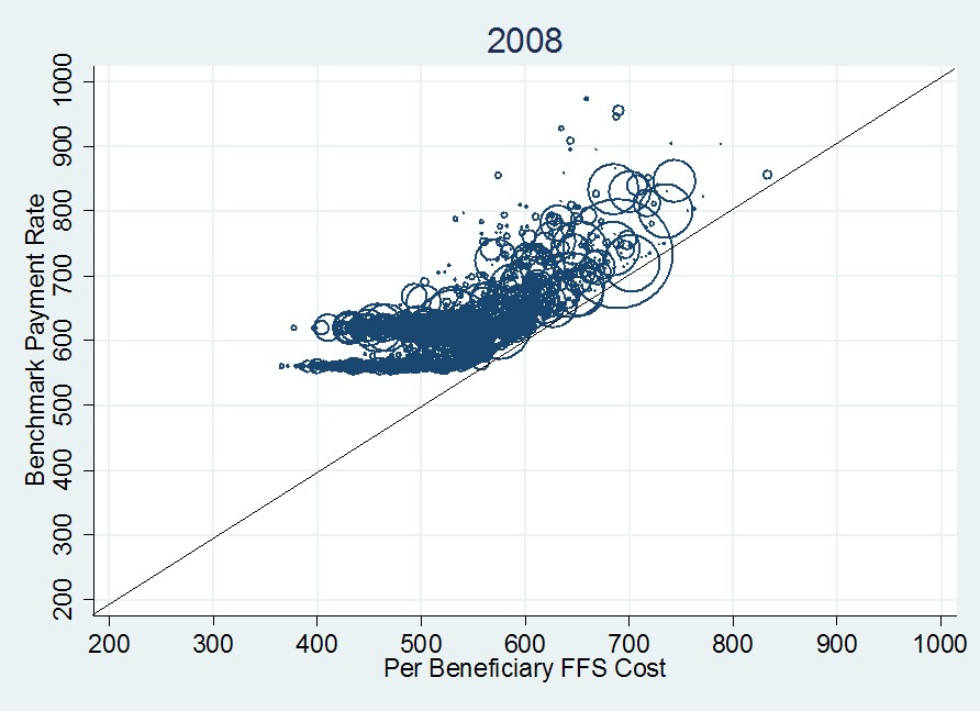
Onward … The first graph, immediately below, plots monthly per beneficiary benchmark payment rate versus per beneficiary FFS cost (both in year 2000 dollars) for 2008. Each datum is a circle that represents a single U.S. county, of which there are about 3,100. The area of each circle is proportional to the total county MA enrollment. The 45-degree line indicates what the payment rate would be if it were set to FFS cost (as recommended by CBO, MedPAC, and the House health reform bill).
The first thing to notice about the 2008 plot is that every county benchmark exceeds FFS cost (the centers of all circles are above the 45-degree line). Moreover, many of them exceed the FFS cost by a lot. This is a visual representation of the additional cost to Medicare of MA enrollees. The second thing to notice is that for FFS costs above ~$550, the data points seem to follow a line that is parallel to the 45-degree line (explained below). The final thing to notice is the clustering around benchmark payment rates of about $550 and $625 for FFS costs below about $550. These two effects–above and below the FFS cost $550 mark–can be explained by the manner in which benchmarks are set.
By statute, benchmark payment rates are a complex function of many things. The key is that since 1997 the function is not directly related to local, current year costs. In each county, the benchmark is the maximum of eight or so various intermediate “candidate benchmarks” (for lack of a better term). Most of the candidate benchmarks are, in one way or another, tied back to historic (not current) county-level FFS costs, trended forward using Medicare’s overall (national) cost inflation rate. This accounts for the linear (45-degree line) trend in the foregoing figure above $550 in FFS cost. (Clearly benchmarks are related to local, current year FFS costs. The plot is not complete randomness. But since local, current year FFS costs are also observable to the researcher, one can control for it.)
Large urban areas with populations of over 250,000 people are subject to a minimum urban floor rate. Other less populated areas are subject to a minimum rural floor rate. These account for the clustering at $550 (due to rural floor) and $625 (due to urban floor) for FFS costs below about $550. The actual benchmark is the county-level maximum of all the various candidates, which explains, in broad terms, the rest of the structure of the graph.
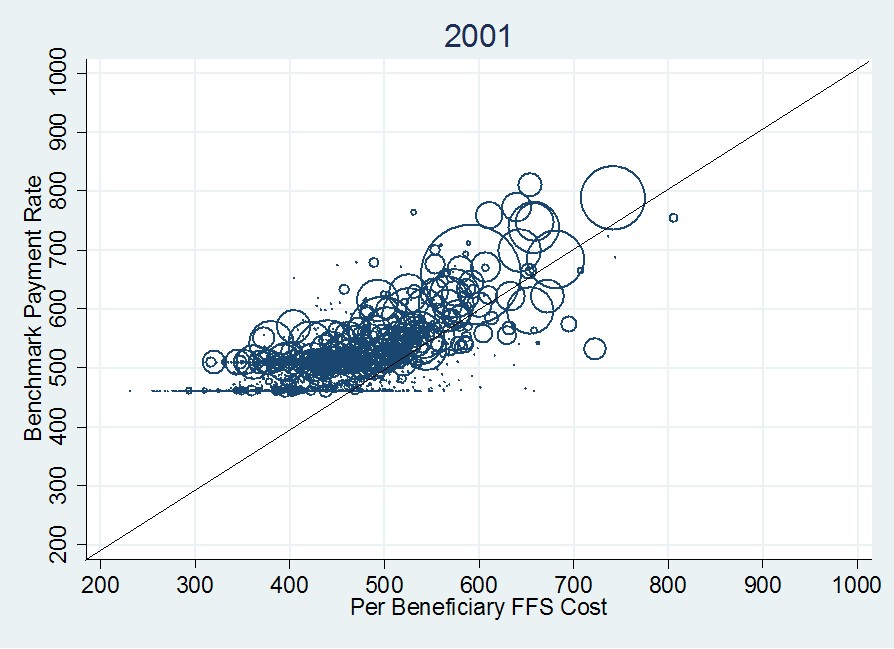
The choice of year isn’t that relevant here. The general structure of the foregoing graph is the same in 2009 and for several years prior to 2008. Go way back to 2001, however, and things look a bit different (see the following figure). Notice that in 2001 some payment rates are below FFS costs (the 45-degree line). Also, notice that the effect of the urban and rural floors is less pronounced.
In general, data in the 2001 graph are shifted downward and leftward relative to the 2008 figure. Though both are adjusted to 2000 dollars, they are done so using the CPI-U, not medical inflation. The latter has grown more quickly than the former so 2008 payments and costs are higher than those for 2001, even accounting for general inflation. It is also worth noting that the 2001 figure are actual payments. Though the vertical axis is labeled as “benchmark,” such a thing didn’t exist in 2001. However, as mentioned, the difference between benchmarks and payments is small.
The differences between the 2001 and 2008 figures can be explained by a combination of changes in payment rate methodology (I won’t go into it, though urban and rural floors existed in both years) and the emergence of private fee for service plans (such plans are explained in a prior post). PFFS plans emerged in 2001 but didn’t become popular until after 2005. They have expanded rapidly in urban and rural floor counties, causing those features to be more pronounced in the 2008 graph as compared to the 2001 graph. More than any other plan type, PFFS plans are responsible for the increase in costs of the MA program over this time period.
In conclusion, the fact that MA payments are set administratively (by statute) and partly in ways divorced from local, current year cost explains why per beneficiary MA payments exceed those of FFS Medicare and why the difference between the two has been growing over time. These are not new revelations. But the graphs above make obvious the effects of what is otherwise an inscrutable payment system.


