
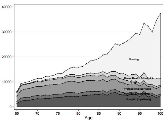
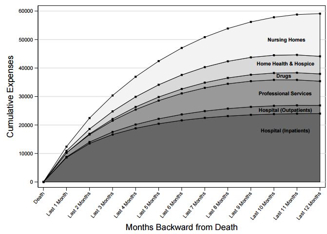
Here are two fascinating charts from the recent NBER working paper by Mariacristina De Nardi and colleagues. Both are average, per person total health care spending by type of service, the first by age and the second by month prior to death. The second is estimated from a model, which is why it’s so smooth.
Two points:
- Nursing home care is driving the entirety of growth in health spending after age 85 or so. Even before age 85, it’s the main driver. (Yes, the article says “nursing home” specifically, even when referencing the figure that just says “nursing”.)
- Hospital care is the biggest source of cost in the last year of life, followed by nursing home care.
- Per person spending is not informative about total spending. One would have to multiply by the number of people (and by age, for age-specific averages, per the first chart above). I point this out just so those on Twitter who think I’m not aware of this fact are assured that I am.
