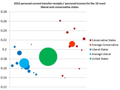
Some commenters (and emailers) suggested that I improve the chart I made that Paul Krugman posted by adding in state population with bubble size. Well, in the immortal words of Yul Brynner, “So it has been spoken, so it shall be done”:
UPDATE: Man, you guys are picky. I redid the colors. Here’s the data:
| State | CTR/Income | Population |
| Tennessee | 0.222656052 | 6346105 |
| Idaho | 0.198588989 | 1567582 |
| Nebraska | 0.159104736 | 1826341 |
| Oklahoma | 0.206684104 | 3751351 |
| Arkansas | 0.244379332 | 2915918 |
| Louisiana | 0.206262682 | 4533372 |
| Alabama | 0.236314519 | 4779736 |
| Wyoming | 0.139698511 | 563626 |
| Utah | 0.143995998 | 2763885 |
| Mississippi | 0.260953506 | 2967297 |
| Average Conservative | 0.211749692 | 32015213 |
| Connecticut | 0.146790688 | 3574097 |
| New Hampshire | 0.150398409 | 1316470 |
| Rhode Island | 0.210748799 | 1052567 |
| New Jersey | 0.153863101 | 8791894 |
| California | 0.163510428 | 37253956 |
| Hawaii | 0.159355519 | 1360301 |
| New York | 0.192638358 | 19378102 |
| Washington | 0.170722276 | 6724540 |
| Oregon | 0.205603994 | 3831074 |
| Massachusetts | 0.165436292 | 6547629 |
| Average Liberal | 0.170696378 | 89830630 |
| UNITED STATES | 0.184604932 | 308143815 |

