
Equality of opportunity means that we are not a caste society. Who we will become is not fixed by the circumstances of our births. Some children will do better than others, but this should result from a fair competition. Nearly every American politician espouses a commitment to equality of opportunity. For example, Majority Leader Eric Cantor wrote yesterday that
We must continue to fight for equal opportunity to a quality education for all children.
I wouldn’t be surprised if many American politicians said the same thing yesterday.
But we don’t appreciate how deep inequality runs. The graph below is from a presentation by Angus Deaton which (I believe) reported data from the National Health Interview Survey. The horizontal axis is the logarithm of family income in 1982 dollars, running from about $3600 to over $80,000. The vertical axis is self-reported ill-health (higher numbers reflect worse health). The parallel lines represent different age groups of respondents.
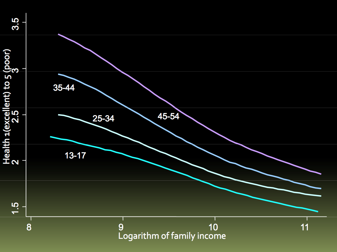
There are three important facts packed into this slide. First, the lines stack up in order of increasing age, meaning that older people reported worse health than younger people. Second, all the lines slope downward, meaning that the poorer you were, the more likely you had poor health.
These facts are unsurprising, until you notice how powerful the income effect is. The leftmost point of the youngest (turquoise) line is above the rightmost point of the oldest (purple) line. This means that the poorest teenagers reported themselves as less healthy than rich middle-aged people.
Lastly, notice how the age lines are much more dispersed on the left (poorest) side of the graph than the right (richest) side of the graph. This means that health deteriorates more quickly with age among the poor than among the rich.
Jason Fletcher has a new study in which he looked at the parent-reported health of a cohort of children from kindergarten through 8th grade.
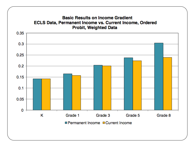
The vertical axis is the coefficient for the regression of health on family income. Think of this number as representing the slope of one of the lines in the Deaton graph. That is, the higher the bar in Fletcher’s chart, the steeper the slope, and the greater the gap in child health between poor families and rich families. (The different bar colors reflect two different ways of measuring family income.) What you see is that the health gaps between poorer and better off children grew as these children aged. The biological damage of poverty is cumulative.
What would we have seen if Fletcher had been able to look at these children starting at birth instead of kindergarten? Probably the health gaps between poorer and richer children would have been smaller for toddlers and infants. Nevertheless, there is substantial evidence that health inequality starts at birth, or even conception. As Janet Currie argues, there is
huge inequality in health at birth. For example, the incidence of low birth weight (birth weight less than 2500 grams) is more than three times higher among children of black high school dropout mothers than among children of white college educated mothers.
This may be partly a matter of genes. But the infants of the poor are also at risk because poor mothers have poorer health, are more stressed, and are more likely to be exposed to environmental toxins. Poverty gets underneath the skin, starting in the uterus.
Poor health deriving from inequality of economic well-being begins at birth and accumulates as children develop. We are farther from equality of opportunity than most of us acknowledge.
