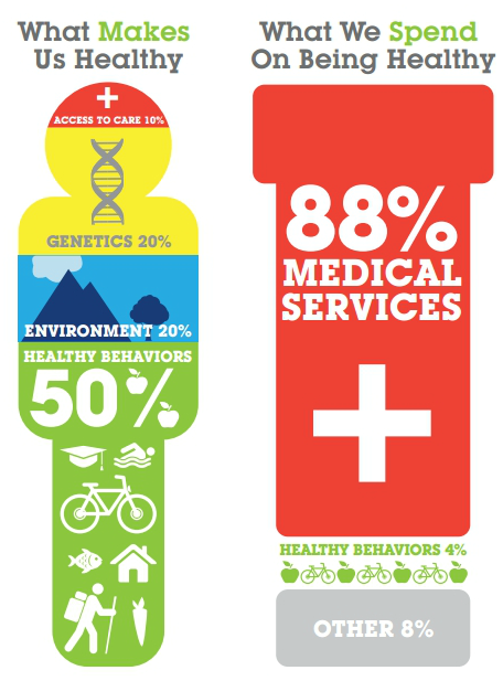
As Ezra Klein noted, The Bipartisan Policy Center included this infographic in their report on obesity and its economic consequences (PDF).
Do you buy the numbers in this infographic? I don’t see any reason why we should. First of all, the report tells us that the source for the graphic is “Derived from information from the Boston Foundation (June 2007).” But there is no additional information saying what this means. Where did the Boston Foundation get the numbers in June of 2007? We can’t tell. We can’t even tell where to look.
What I do know is that the figures in the “What Makes Us Healthy” side of the chart are pretty close to those offered by McGinnis et al.:
Using the best available estimates, the impacts of various domains on early deaths in the U.S. distribute roughly as follows: genetic predispositions, about 30%; social circumstances, 15%; environmental exposures, 5%; behavioral patterns, 40%; and shortfalls in medical care, 10%.
But these figures are about what kills us, not what makes us healthy. Is that what the infographic is telling us too? The near correspondence of the numbers to those in McGinnis et al. makes me wonder. In particular, notice that both the infographic and McGinnis et al. say that medical care plays only a 10% role in keeping us healthy (or killing us). About this, Booske et al. (PDF) write,
The “long standing estimate” of 10% for medical care is actually based on “expert” estimates of the contribution of health care system deficiencies to total mortality (DHHS, 1980).
Meanwhile, David Cutler and others suggest that health care is responsible for 50% of the gains in longevity over the past half century. Now, I have not read the underlying literature on this. I have not read DHHS (1980), nor can I find it. I will also confess that I have not read the full BPC report, which may be fantastic, notwithstanding my concerns about the infographic.
Still, it seems to me there is no good reason to accept the 10% figure at the top of the left-hand side of the infographic. I’d like to know more how it got there. I’d like to hear the best argument as to why it’s correct.


