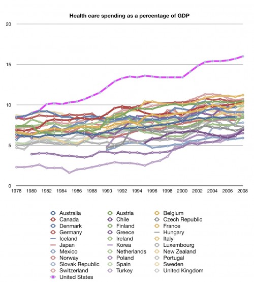
I’m getting e-mails and comments asking about health care spending since 1980. Specifically, why did the U.S. pull away from the OECD pack beginning then?
The divergence since 1980 is not that puzzling and we’ve covered it here before (and recently!). But maybe we didn’t make it explicit enough.
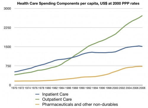
Aaron’s chart from a recent post shows outpatient care taking off is the biggest factor.
That outpatient spending is a big factor in excess U.S. health spending (above that predicted by GDP) is one conclusion documented in Aaron’s series on health care spending. As for what it is about outpatient care that is responsible for the rapid increase, Uwe Reinhardt and colleagues told us fairly convincingly that it’s the prices, stupid (true for other settings too).
We could keep asking why. Why are prices rising faster in the U.S. than elsewhere? At this point I think it gets complicated and there are likely multiple factors relating to policy, provider market power (e.g. hospital consolidation), technology, etc. Even though we may not know all the answers, we certainly know some. What’s happened since the 1980s is not a complete mystery.
It’s also important to keep in mind that the first graph above is health care spending divided by GDP. So, changes in GDP affect the lines too. (On that, more here and here.)


