
UPDATE: Chart deemed bogus. See comments. Rest of post altered to reflect that fact, including a big red “X” through the chart. I’ve left this post up to document the problems with the chart. If you use the chart and don’t mention those or refer readers to the comments below, you’re acting irresponsibly.
Dan Munro has a post up at Forbes: The Year In Healthcare Charts. Though they’re all worth a look, this is the one that dilated my pupils:
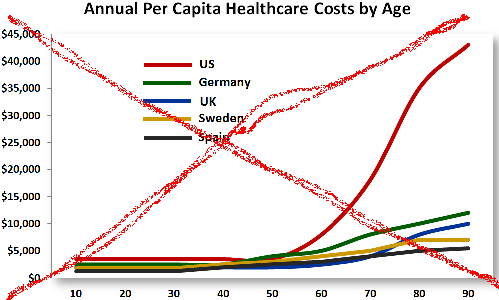
This is, apparently, from a year 2005 study. There are many problems with the chart, as raised in the comments.
