Life Expectancy at birth and health care spending per capita, 2011 (or nearest year):
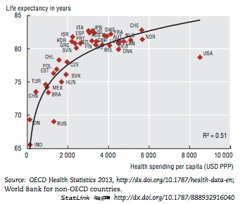
One of these things is not like the others.

Life Expectancy at birth and health care spending per capita, 2011 (or nearest year):
One of these things is not like the others.
