Something’s been bothering me about the last few days’ discussion of skin in the game, or out-of-pocket payments for health care. I’m not going to review all of it, but I encourage you to go read posts by Andrew Sullivan, Megan McArdle, Tyler Cowen, and Paul Krugman if you haven’t already. And me, of course.
What’s been bothering me is how to accurately portray how much we’re paying out-of-pocket. One way is to list the amount that people pay, standardized to $US purchasing power parity. When you do so, with the exception of Switzerland, we have pretty much the largest amount of “skin in the game” of any country in the world.
If, however, you use out of pocket spending as a percentage of all health care spending, then we look like we have relatively little skin in the game.
I think there’s still a problem with that methodology, however. We spend so much more on health care than everyone else, even when you account for our GDP, that even though we have a lot of out-of-pocket spending, it’s going to look small when compared to total health care spending.
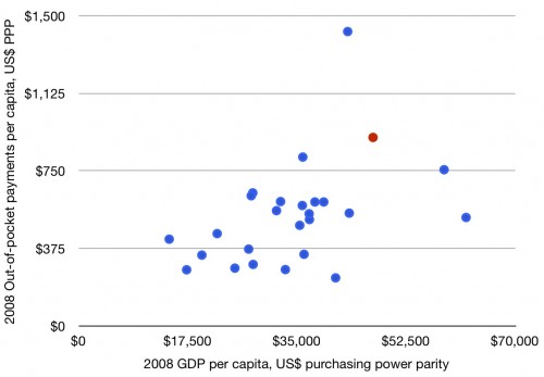
So I came up with this:
What you’re looking at is out-of-pocket spending per person in 2008 versus GDP per capita in 2008 for all available OECD countries. In essence, I think this is a fair way to look at how much we are spending per person on out-of-pocket health care costs versus how much money people have, in their respective countries. When you look at this, Switzerland still spends more (they’re the dot at the top of the chart), but the US (the red dot) is not an “under-spender” when it comes to out-of-pocket health care costs.
In fact, I think it’s fair to say, from the above, that we’re likely “above average” when it comes to out-of-pocket spending versus GDP. I still maintain that it’s hard to claim we don’t have plenty of skin in the game.


