A couple weeks ago, Bill posted about the JAMA paper on medical research. Below I share a few of the paper’s charts. Some you may want to click to enlarge.
1. The U.S. invests a lot in cancer. (But, note, cancer is nowhere near the top in terms of total health care spending or spending growth.)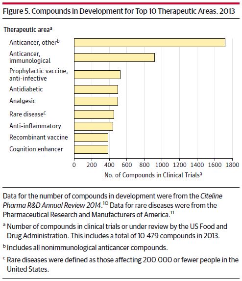
2. AHRQ and health services industry research funding grew a lot between 2004 and 2011.

3. OK, biotech is big.
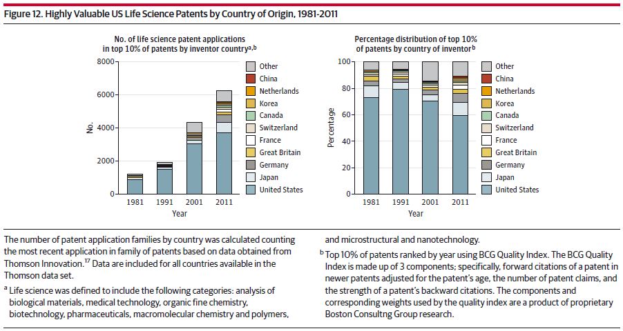
4. Here comes China.
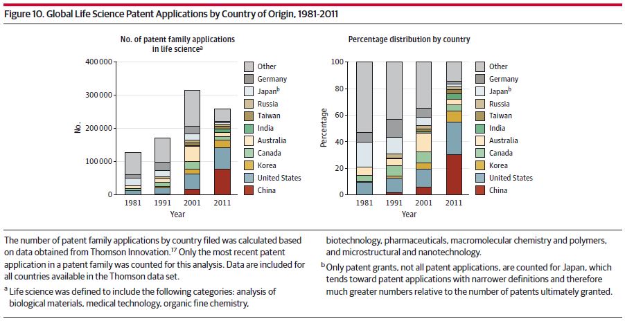
5. Or maybe not so much China. (“Highly valuable patents are defined by the frequency they are cited by other inventors in subsequent patent applications.”)
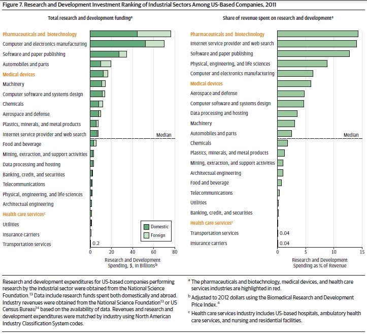
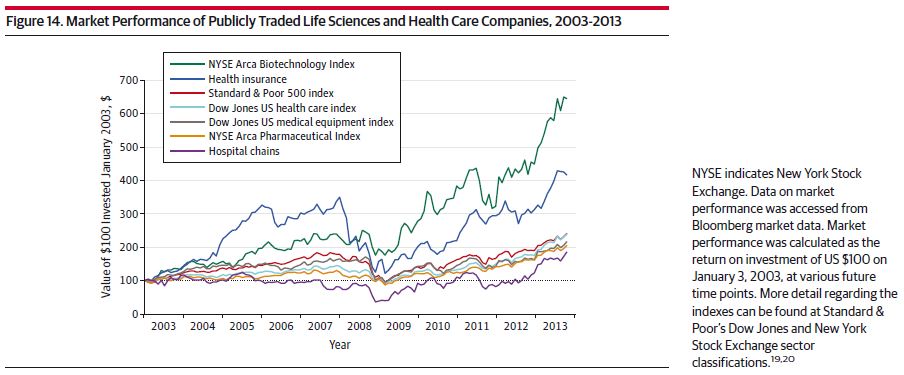
6. We’re more bullish on biotech and health insurance than other areas of health care, including hospitals.
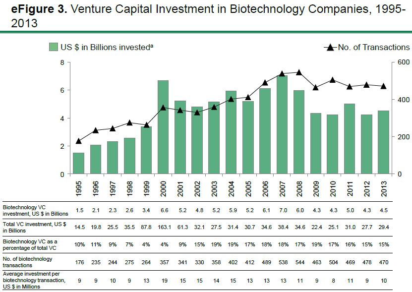
7. Biotech venture capital is holding steady (positive spin). It’s not growing as quickly as it was before 2009 (negative spin). See also this recent Health Affairs piece by Sabin Russell.
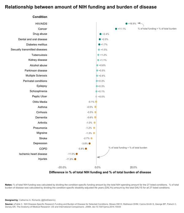
8a. Evidence of allocative inefficiency.
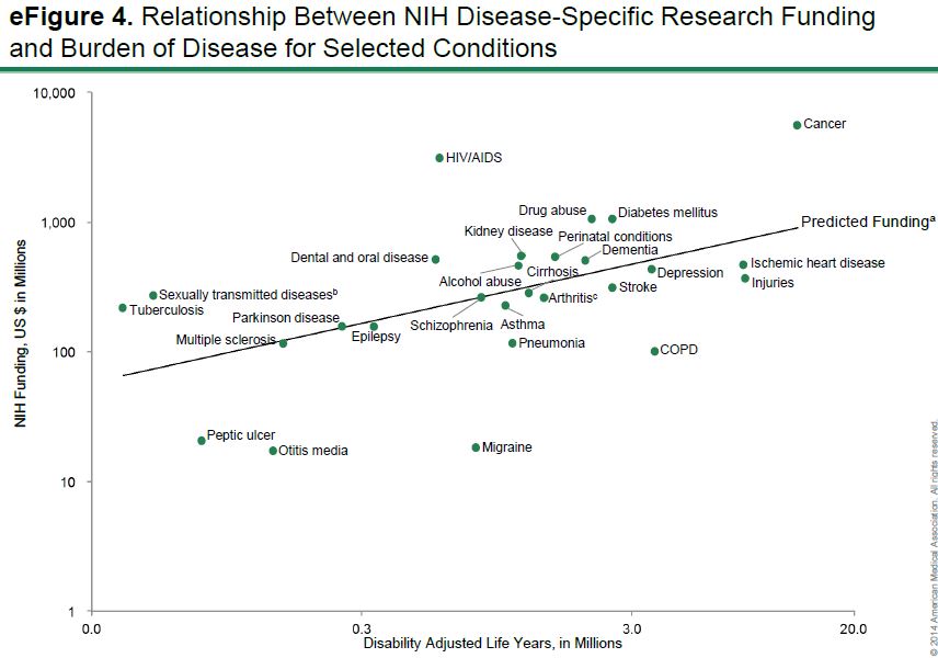
8b. Another look, via Chad Cotti: