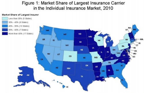
Last week, the Kaiser Family Foundation released a report that examined the competitiveness of the individual and small-group insurance markets by state. Not surprisingly, they found that many states had high levels of market concentration, though there is considerable variation. In this post, I’ll focus on the individual market because I have found data for that market type to supplement the KFF analysis.
Here’s what KFF found:
The majority of states (30, plus the District of Columbia) had individual insurance markets with at least half of the market dominated by a single insurance company in 2010. The median market share held by the largest insurance carrier in each state was 54% (meaning that in half the states the largest plan had a market share greater than 54% and half had a market share lower). […]
[S]tates in the West generally have more competitive markets while more rural states in the upper Midwest and parts of the South and Mid-Atlantic are less competitive, although there are numerous exceptions to this pattern. States where the largest insurer is least dominant include Wisconsin, Colorado, Missouri, Pennsylvania, and New York. The largest insurers in these states’ individual markets accounted for 21% to 34% of total enrollment. At the other end of the spectrum, the largest insurer in Alabama and Indiana represented 86% and 84% of each state’s individual market enrollment, respectively.
KFF findings, as well as mine below, are similar using other measures of market concentration (see the report for details).
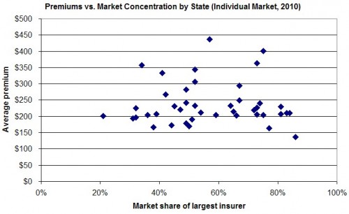
What are we to conclude from this? It’s tempting to believe that higher insurer market concentration implies higher premiums. However, it is not clear that is so. It isn’t even clear that should be so, as I will explain. First, let’s look at how premiums relate empirically to market concentration. I made the chart below by combining data from the KFF report with state average individual market premiums for 2010, as provided by statehealthfacts.org.*
You can see clearly from the chart that as market share increases, so does average premium, right? No? Me neither. A regression line through these data (not shown) is exactly horizontal. There’s no obvious causal relationship running from market concentration to premium suggested by this simple analysis. That doesn’t mean there isn’t one. It could be that it is just confounded by a reverse causal relationship from premiums to market concentration. Perhaps insurers gain higher market concentration by having lower premiums (either due to lower costs or to predatory pricing, for example).
But we shouldn’t even expect a simple relationship between market concentration and premiums. Insurer market concentration, being one measure of market power, is relevant to premiums, but it is not the only factor. As described by Sarah Kliff recently and me many times (this post is as good as any), cost of care is a larger factor. Another factor is provider, or hospital, market concentration.
Putting all that together in one analysis of premium levels–and using appropriate techniques to make plausible causal inferences–has never been done, to my knowledge. (It’s technically hard and all necessary data are not readily available.) What we believe to be true from theory (pdf) is that insurer market concentration can lead to lower or higher premiums, depending on other market factors. Consequently, you can’t conclude anything at all about premiums from an analysis of insurer market concentration alone, despite what some may wish you to infer and what you read in the papers.
* Premium data unavailable for Alaska, Kansas, Nevada, New Mexico, Ohio, Oklahoma, and Texas. California omitted because reported premium was from a different source than all other data and was a multiple of any other premium, a clear outlier.


