A number of you have asked me to further explain the chart and scorecard I am putting at the bottom of every post. Here you go.
Before I get started, though, please remember – this is only a handy aid, not a scientific and validated rating system. I’m giving you a quick way to compare how the US fared in that post, compared to the other countries in that post, and then a simple way to think about how the US fared in that post compared to other posts.
Here is an example:
In this example, the US was the best in Subcategory One compared to the other countries. For Subcategory Two, data were only available for six countries, and among those, it was the worst. Please don’t post a comment to complain that the UK might be hiding data. I am not saying the US is worse than the UK in Subcategory Two. I’m saying it was the worst compared to the other countries. For Subcategory Three, the US tied with Germany for fourth. When I’m showing data over a number of years, I will be averaging over those years unless I say otherwise.
I then try and come up with a summary (Category A). It’s pretty much an average of the individual rankings. It’s not scientific or weighted or validated, so don’t try and repost it as NEWS! It’s my way of summarizing what you see.
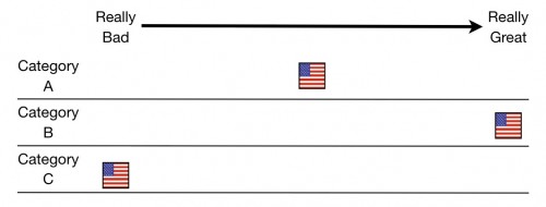
Then we will have a scorecard:
This is a summary of posts so far. You can see Category A there as it was taken from the previous chart. I’ve eliminated other countries because different metrics will involve different countries of comparison as different data are available. Moreover, sometimes worst means worst of seven, and sometimes it means worst of 15. The truth of the matter is, this should be seen more as a guide. We’re doing great in Category B, we’re somewhat average in Category A, and there’s lots of room for improvement in Category C. A new category will be added each day.
I’m saying this up front because I have no hidden agenda. I’m not trying to make you think that things are better or worse than they are. As I have said many times, no metric is perfect and they are all flawed in some way. I’m going to show you lots of them, so you can see how we are doing in each. But the summaries and conclusions are mine and not validated or scientific and should not be treated as such.
Please, I beg of you, I don’t want to see any posts that shout “The US is last in the world in Category C!!!” That’s not what I’m saying. I’m saying that with respect to Category C, there seems to be a lot of room for improvement. Especially given how much we’re spending.


