Aaron had sent me some nice figures from a talk he gave that showed how the U.S. ranks relative to other wealthy nations on various health outcomes. It’s not good news, as I’m sure most readers are aware. It’s particularly bad news considering how much more we spend for those outcomes.
Anyway, I was going to collapse all those figures into one or two for my upcoming talk (for which I’ve been preparing and about which I’ve posted before). But that’s a lot of work. Wouldn’t it be nice if someone had already done it and posted figures on the web? Well, The Conference Board of Canada did and they’re rather nice. I don’t know their precise methodology but their findings are qualitatively similar to those reported elsewhere so they’ll do for my needs, which is only to show that the U.S. ranks poorly on outcomes despite its tremendous spending.
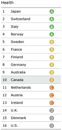
First, an overview. Here’s The Conference Board’s grades on health for 16 wealthy countries. Note that these are for health (i.e. physical well being) not the health system or health technology or any intermediate measure of quality. Naturally The Conference Board of Canada highlighted the results for their country. They, not I, added the shading of Canada to the figure.

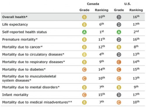
Yep, we’re dead last. Ouch! The Conference Board also provides a figure with grades and rankings by outcome measure (some rankings are out of 17 countries, some out of 16). It includes Canada too, which is not my focus.
Interestingly, the U.S. is near the top (2nd) in self-reported health status–we say we’re healthy–but in all other measure we’re near the middle or bottom of the pack. Canada, as it turns out is number one in self-reported health status, despite having relatively little to crow about itself (other than, perhaps, being not as bad as the U.S.). Looks like North America has a superiority complex. On the other hand, it’s hard for dead people answer survey questions. The U.S. is last in infant mortality (Canada is nearly so) and life expectancy.
I am sure one could cook up charts like these that make the U.S. look good. If you choose your measures right, we’re number 1, or nearly. Not everything about the U.S. health system is horrible. But some things–some very important things–are quite bad. It’s nothing to be proud of and it certainly isn’t anything to bury or ignore. We should be getting more for our money. If not, I, for one, would like a refund.


